
Toydata - Scikit-Learn - Diabetes

Scikit-Learn 의 Diabetes 데이터셋
- 사이킷런에서 제공하는 여러 토이데이터셋 가운데 diabetes (당뇨병) 살펴보기
- schikit learn 의 diabetes 데이터
- 사이킷런 제공 연습데이터셋 리스트
- diabetes 공식문서
데이터 확인
불러오기
- 기본적인 방법으로 데이터 불러오기
# 라이브러리 임포트
from sklearn import datasets

# 당뇨병데이터 불러오기
diabetes = datasets.load_diabetes()
데이터 확인
- sklearn 에서 제공하는 토이데이터는 딕셔너리형태로 제공
- 딕셔너리 형태는 {key : value}
- 예
{‘이름’ : ‘홍길동’,
‘사는곳’ : ‘아산시 탕정면’,
‘age’ : 38}
- 데이터 딕셔너리가 가지고 있는 key 가 무엇이 있는지 확인
diabetes.keys()dict_keys([‘data’, ‘target’, ‘frame’, ‘DESCR’, ‘feature_names’, ‘data_filename’, ‘target_filename’, ‘data_module’])
- key를 하나하나 확인하여 key에 있는 value를 확인해보자
-
data
diabetes.dataarray([[ 0.03807591, 0.05068012, 0.06169621, …, -0.00259226, 0.01990842, -0.01764613], [-0.00188202, -0.04464164, -0.05147406, …, -0.03949338, -0.06832974, -0.09220405], [ 0.08529891, 0.05068012, 0.04445121, …, -0.00259226, 0.00286377, -0.02593034], …, [ 0.04170844, 0.05068012, -0.01590626, …, -0.01107952, -0.04687948, 0.01549073], [-0.04547248, -0.04464164, 0.03906215, …, 0.02655962, 0.04452837, -0.02593034], [-0.04547248, -0.04464164, -0.0730303 , …, -0.03949338, -0.00421986, 0.00306441]])
- 흔히 독립변수, 피쳐라고 부르는 데이터들이 나온다
- 행과 열이 있는 2차원 배열이다
-
target
diabetes.targetarray([151., 75., 141., 206., 135., 97., 138., 63., 110., 310., 101., 69., 179., 185., 118., 171., 166., 144., 97., 168., 68., 49., 68., 245., 184., 202., 137., 85., 131., 283., 129., 59., 341., 87., 65., 102., 265., 276., 252., 90., 100., 55., 61., 92., 259., 53., 190., 142., 75., 142., 155., 225., 59., 104., 182., 128., 52., 37., 170., 170., 61., 144., 52., 128., 71., 163., 150., 97., 160., 178., 48., 270., 202., 111., 85., 42., 170., 200., 252., 113., 143., 51., 52., 210., 65., 141., 55., 134., 42., 111., 98., 164., 48., 96., 90., 162., 150., 279., 92., 83., 128., 102., 302., 198., 95., 53., 134., 144., 232., 81., … …
- 종속변수, 타겟이라고 부르는 데이터
- 1차원 배열
- DESCR
print(diabetes.DESCR)Diabetes dataset ---------------- Ten baseline variables, age, sex, body mass index, average blood pressure, and six blood serum measurements were obtained for each of n = 442 diabetes patients, as well as the response of interest, a quantitative measure of disease progression one year after baseline. **Data Set Characteristics:** :Number of Instances: 442 :Number of Attributes: First 10 columns are numeric predictive values :Target: Column 11 is a quantitative measure of disease progression one year after baseline :Attribute Information: - age age in years - sex - bmi body mass index - bp average blood pressure - s1 tc, total serum cholesterol - s2 ldl, low-density lipoproteins - s3 hdl, high-density lipoproteins - s4 tch, total cholesterol / HDL - s5 ltg, possibly log of serum triglycerides level - s6 glu, blood sugar level Note: Each of these 10 feature variables have been mean centered and scaled by the standard deviation times `n_samples` (i.e. the sum of squares of each column totals 1). Source URL: https://www4.stat.ncsu.edu/~boos/var.select/diabetes.html For more information see: Bradley Efron, Trevor Hastie, Iain Johnstone and Robert Tibshirani (2004) "Least Angle Regression," Annals of Statistics (with discussion), 407-499. (https://web.stanford.edu/~hastie/Papers/LARS/LeastAngle_2002.pdf)- 데이터에 대한 소개를 볼 수 있는 key
- 혈액정보가 포함되어있는 10개의 당뇨병과 관련된 변수
- 각 변수는 442개 측정값
- 종속변수는 1년 후의 병의 경과에 대한 양적인 측정값
- 각 변수는 평균중심화하고, 표준편차와 샘플 수의 곱으로 나누었음
- 평균은 0, 합은 1로 변형
-
feature_names
diabetes.feature_names- 각 독립변수(=피쳐)의 이름
-
data_filename, target_filename
print(diabetes.data_filename) print(diabetes.target_filename)- 데이터파일 이름과, 타겟파일 이름
데이터 준비
- pandas 데이터프레임
import pandas as pd df = pd.DataFrame(diabetes.data, columns=diabetes.feature_names) df['target'] = diabetes.target df- diabetes.data 을 데이터프레임 df로 지정
- df에 target 추가
- df 정보
df.info()<class 'pandas.core.frame.DataFrame'> RangeIndex: 442 entries, 0 to 441 Data columns (total 11 columns): # Column Non-Null Count Dtype --- ------ -------------- ----- 0 age 442 non-null float64 1 sex 442 non-null float64 2 bmi 442 non-null float64 3 bp 442 non-null float64 4 s1 442 non-null float64 5 s2 442 non-null float64 6 s3 442 non-null float64 7 s4 442 non-null float64 8 s5 442 non-null float64 9 s6 442 non-null float64 10 target 442 non-null float64 dtypes: float64(11) memory usage: 38.1 KB- 테이터타입은 판다스 데이터프레임
- 442개 인덱스
- 11개 컬럼
- 11개 컬럼 모두 float(소수형) 타입
- 기술통계
df.describe()age sex bmi bp s1 s2 s3 s4 s5 s6 target count 442.000 442.000 442.000 442.000 442.000 442.000 442.000 442.000 442.000 442.000 442.000 mean -0.000 0.000 -0.000 0.000 -0.000 0.000 -0.000 0.000 -0.000 -0.000 152.133 std 0.048 0.048 0.048 0.048 0.048 0.048 0.048 0.048 0.048 0.048 77.093 min -0.107 -0.045 -0.090 -0.112 -0.127 -0.116 -0.102 -0.076 -0.126 -0.138 25.000 25% -0.037 -0.045 -0.034 -0.037 -0.034 -0.030 -0.035 -0.039 -0.033 -0.033 87.000 50% 0.005 -0.045 -0.007 -0.006 -0.004 -0.004 -0.007 -0.003 -0.002 -0.001 140.500 75% 0.038 0.051 0.031 0.036 0.028 0.030 0.029 0.034 0.032 0.028 211.500 max 0.111 0.051 0.171 0.132 0.154 0.199 0.181 0.185 0.134 0.136 346.000 - 10개 피쳐들의 평균이 0이다.
df.describe()||sum | |:—:|:—:| | age |-0.000 | | sex |0.000 | | bmi |-0.000 | | bp |0.000 | | s1 |-0.000 | | s2 |0.000 | | s3 |-0.000 | | s4 |0.000 | | s5 |-0.000 | | s6 |-0.000 | | target |67243.000 |
- 10개 변수들의 합계는 0이다.
df.isna().sum()||0 | |:—:|:—:| | age |0.000 | | sex |0.000 | | bmi |0.000 | | bp |0.000 | | s1 |0.000 | | s2 |0.000 | | s3 |0.000 | | s4 |0.000 | | s5 |0.000 | | s6 |0.000 | | target |0.000 |
- 혹시나 해서 결측값을 찾아보았지만, 결측값은 없다.
df.duplicated().sum()- 중복값도 없다.
-
상관관계
df.corr()age sex bmi bp s1 s2 s3 s4 s5 s6 target age 1.000 0.174 0.185 0.335 0.260 0.219 -0.075 0.204 0.271 0.302 0.188 sex 0.174 1.000 0.088 0.241 0.035 0.143 -0.379 0.332 0.150 0.208 0.043 bmi 0.185 0.088 1.000 0.395 0.250 0.261 -0.367 0.414 0.446 0.389 0.586 bp 0.335 0.241 0.395 1.000 0.242 0.186 -0.179 0.258 0.393 0.390 0.441 s1 0.260 0.035 0.250 0.242 1.000 0.897 0.052 0.542 0.516 0.326 0.212 s2 0.219 0.143 0.261 0.186 0.897 1.000 -0.196 0.660 0.318 0.291 0.174 s3 -0.075 -0.379 -0.367 -0.179 0.052 -0.196 1.000 -0.738 -0.399 -0.274 -0.395 s4 0.204 0.332 0.414 0.258 0.542 0.660 -0.738 1.000 0.618 0.417 0.430 s5 0.271 0.150 0.446 0.393 0.516 0.318 -0.399 0.618 1.000 0.465 0.566 s6 0.302 0.208 0.389 0.390 0.326 0.291 -0.274 0.417 0.465 1.000 0.382 target 0.188 0.043 0.586 0.441 0.212 0.174 -0.395 0.430 0.566 0.382 1.000 - 가장 마지막 행이 타겟이기 때문에, 타겟행만 보면…
- 체질량지수(bmi)와 혈청 트리글리세리드 수치(s5)가 상관관계가 높다.
- 상관관계 표 보기좋게 그리기
import numpy as np
import matplotlib.pyplot as plt
import seaborn as sns

# 상관관계 히트맵 그리기
coff_df = df.corr()

# 그림 사이즈 지정
fig, ax = plt.subplots( figsize=(12,12) )
fig.suptitle('Correlation Heat Map', fontsize = 24, fontweight = 'bold', y = 0.95)

# 삼각형 마스크를 만든다(위 쪽 삼각형에 True, 아래 삼각형에 False)
mask = np.zeros_like(coff_df, dtype=np.bool)
mask[np.triu_indices_from(mask)] = True

# 히트맵을 그린다
sns.heatmap(coff_df,
            cmap = 'RdYlBu_r',
            annot = True,             # 실제 값을 표시한다
            mask=mask,                # 표시하지 않을 마스크 부분을 지정한다
            linewidths=.5,            # 경계면 실선으로 구분하기
            cbar_kws={"shrink": .5},  # 컬러바 크기 절반으로 줄이기
            vmin = -1,vmax = 1        # 컬러바 범위 -1 ~ 1
          )
plt.show()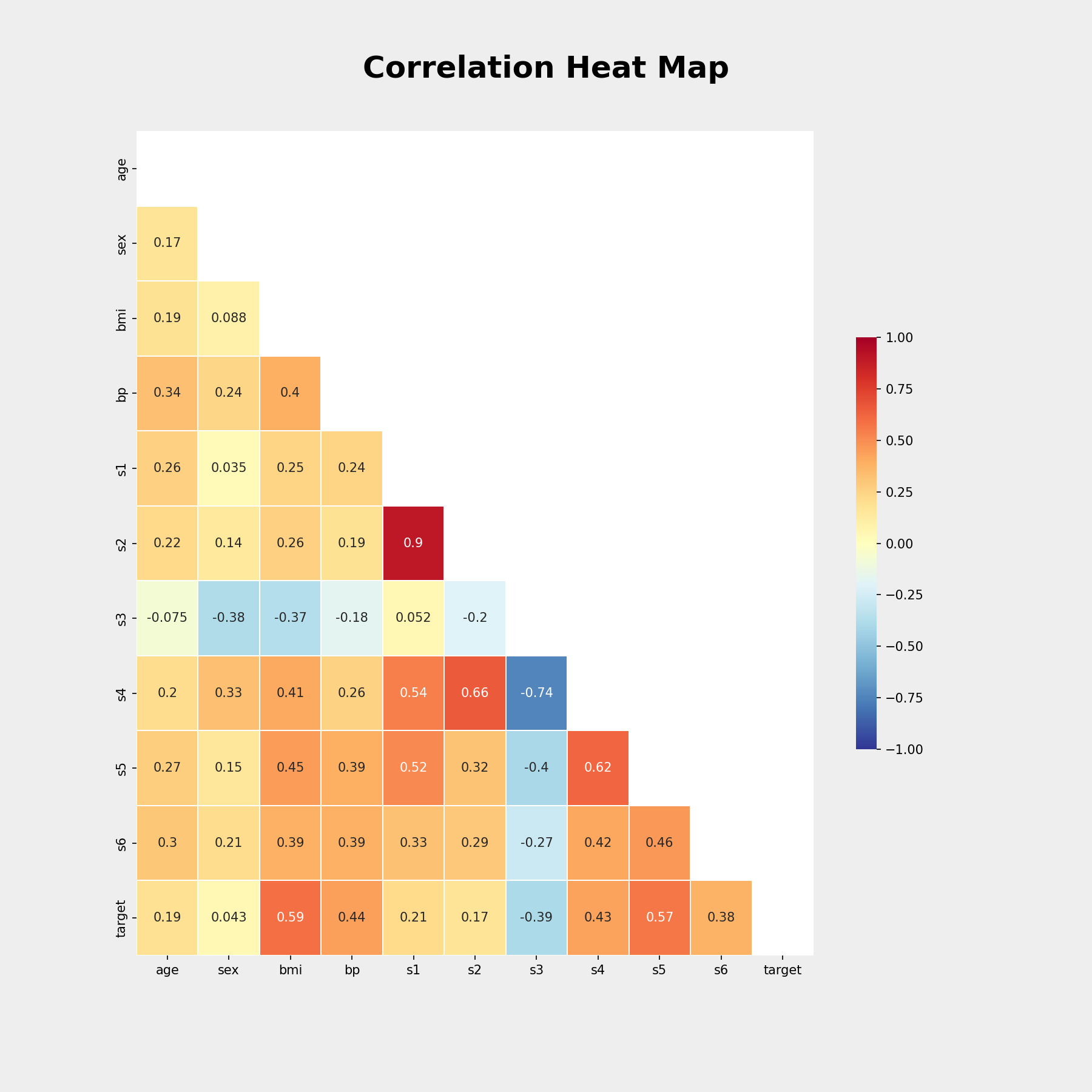
- 데이터 분포 시각화
fig, ax = plt.subplots(nrows=2, ncols=5, figsize=(22,8))
fig.suptitle('Scatter Plots', fontsize = 32, fontweight = 'bold', y = 0.95)

cols = diabetes.feature_names

for i in range(0, 2):
  for j in range(0, 5):
    sns.scatterplot(x = df[cols[i*5 + j]], y = df['target'], ax = ax[i][j])
    ax[i][j].axhline(df['target'].mean(), c='r', label = 'Base of Mean')

plt.show()

# 분석결과 저장
file_name = 'sklearn_diabetes_scatterPlots'
fig.savefig(path_results + file_name, dpi=150, facecolor='#eeeeee')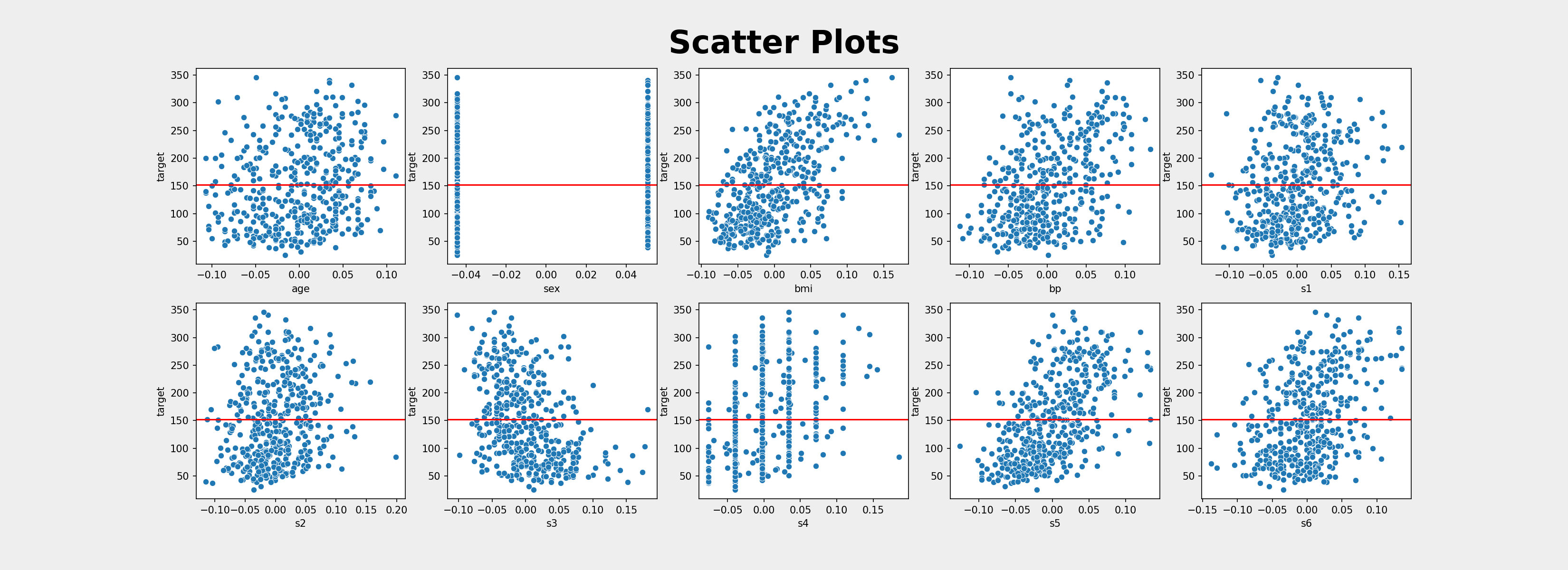


댓글남기기